[ad_1]
In the perennial battle between mapping services, there are two main competitors: Google Maps and Apple Maps. Google Maps was first out of the gate, in 2005, and has since introduced some truly revolutionary features, such as Street View and real-time business foot traffic. Those types of innovations have enabled Google Maps to become the most-used consumer maps service in the world: In February 2020, The Washington Post estimated that it had an 80% mobile market share.
But part of Google Maps’s success, at least on mobile, was due to Apple. Google Maps was the default mapping provider on iPhones until 2012, when Apple debuted its own mapping solution, Apple Maps. Apple’s offering did not get off to a great start, but in the decade since, Apple Maps has become a stellar mapping service on many fronts.
Google Maps still holds around 80% of the mobile market. But in recent years, I’ve found myself getting increasingly frustrated with the Google Maps experience, especially when it comes to general navigation and exploration of a map area.
Here are the five main reasons Google Maps has become a cluttered, frustrating mess—and why I find myself turning to Apple Maps more often.
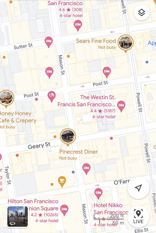
Enough with the hotel and bar pins
Whenever I’m in a major metropolitan area, Google Maps seems to have an obsession with displaying as many hotels, bars, and clubs on the map as it can. This happens even when I haven’t searched for a single hotel or bar. And it happens not only when I’m on vacation in a new city, but when I’m in my home city. Google knows my home address. So, why on Earth does it default to showing me as many hotels as possible in the city where I live?
The same is true of clubs and bars. I see pins for more dance clubs and bars in one small area shown on my smartphone’s display than I’ve ever actually been to in my life. Google knows I’m middle-aged and get up early to work. When I’m just browsing the map, can it really think I might care about the nearest club where patrons normally don’t leave until well past midnight?

By displaying all these irrelevant hotels and bars, Google makes it much harder to browse and navigate the map, since frequently the pins’ labels overlap or obscure more important elements, such as the shape and layout of streets.
Too many ads clutter the map
The square pins you see in Google Maps are ad pins. They represent a place of business (a hotel, spa, etc.) that is paying Google to make sure it’s displayed on the map, despite the business’s irrelevance to me. Again, ad pins for hotels dominate, but right behind them are ad pins for restaurants with small text underneath them imploring me to “Order Delivery with Uber Eats,” which just further clutters the map.
Google is, of course, first and foremost an advertising company. Data compiled by Oberlo showed that 78.2% of its Q1 2023 total revenue of $69.8 billion came from ads. But its enthusiasm for placing ads in every corner of Google Maps just makes it all the more cluttered and increasingly hard to read. And that’s before we even get to…
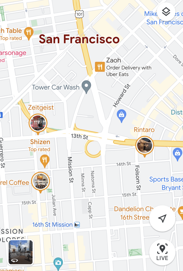
Photo pins signify what, exactly?
Google Maps identifies points of interest primarily by pin color and glyph: Hotels are represented by a pink pin with an image of a person sleeping in a bed, restaurants get an orange pin with a fork and knife, and so forth. Regular pins, denoting businesses or other points of interest, are reverse teardrop-shaped, while ad pins are square-shaped. But, since last year, there is also now a third form: the photo pin.

INSERT IMAGE #2 [Caption: They’re big and round, but what do they mean?]
As best as I can tell, a photo pin is a pin for a business, but instead of a typical category glyph, it shows a large photo ostensibly related to the establishment. These pins don’t appear to signify that the business is notable in any way. (I mean, I’m sure I’ve seen photo pins for muffler repair shops—not exactly a tourist attraction.)
The photo pin might be the ultimate map monopolizer. It’s bigger, and the photo, seemingly pulled from a business’s Google Maps listing, doesn’t always even represent the business well. One photo pin I came across, oddly, seemed to show a photo of the dumpsters behind a restaurant. This just adds to user confusion and more clutter. It isn’t helping the business, either.
I have no interest in someone’s work-from-home business
Another major contributor to Google Maps being an eyesore these days is a holdover from the pandemic when so many people were stuck working from home—or decided to begin offering their services from home. It is not uncommon to be browsing a residential area on Google Maps and be faced with a sea of work-from-home business pins.
The number of “consultant” businesses I’ve seen in residential areas on Google Maps has been shocking. The same goes for web designers, app programmers, and handymen—all of whom operate out of their residential homes. These may all be legitimate businesses run by self-employed people, but why on earth does Google Maps surface their listings on maps if they never have a single client enter their doors and, more important, if I’ve not searched for a provider of any of these services?
Clutter, clutter, clutter.
Why won’t you show me the street name?
Finally, Google Maps seems more intent today on showing bars, restaurants, ads, and work-from-home businesses than useful map-related features. Sometimes it doesn’t even show the most basic information anymore, including street names.
Many times I just want to see the name of the street I’m standing on. So, I open Google Maps and zoom in on my current location. Yet no matter how far in I zoom in, Google Maps doesn’t always apply a label to the street I’m standing on. It just remains blank. Of course, business pins I have no interest in are still prominently displayed.
A workaround I’ve stumbled upon whenever this happens is to select a business pin on the next street over. When Google Maps centers on that, it for some reason will label the street I’m standing on.
Among all the gripes on this list, I think this one is my biggest. If my ad-hoc workaround doesn’t work, I often have to open Apple Maps just to look up the name of the street I’m on.
But for now, I’m stuck with Google Maps
All of the clutter that gets in the way of using the actual map makes me want to quit Google Maps for good. At the very least, Google should give users the option of hiding certain types of pins—say, hotels, for example.
But as much as I’d like to abandon Google Maps for the increasingly more user-friendly Apple Maps, I can’t. Despite Apple Maps making huge gains in usability, navigation, and user interface each year, Apple’s mapping solution still lacks when it comes to point-of-interest information. And as annoyed as I am by all those unwanted pins on my screen, I still often need some of those points of interest, such as popular times, live foot traffic data, reviews, photos, and other useful data that help me plan an outing. It’s nice to know peak wait times for a restaurant and how long customers typically spend there.
Only Google Maps offers all that, so they still have me for now. But please, Google, I’ll let you know when I’m looking for hotels.
[ad_2]
Source link

