[ad_1]
Back in November 2021, Microsoft announced its most ambitious addition to the Office suite in years, though it’s taken until now to publicly launch the thing.
The new arrival is called Microsoft Loop, and it’s an answer to all-in-one document editors such as Notion and Coda, which have taken off as Office alternatives in recent years. Just like those products, Loop lets users create free-flowing, interlinked documents without all the stuffy conventions of Word. It serves as both a place to write and a project management tool, and it hooks into other wings of the Office suite such as Microsoft Teams and Whiteboard.

But after all this time since the initial announcement, Loop is still in rough shape, as evidenced by its Preview tag. It’s missing a lot of features that are table stakes in Notion and its ilk, and some of its smarter ideas are undermined by frustrating design.
Another Notion-like experience
Loop borrows many of the conventions that have made tools like Notion so popular. (As of October 2021, Notion had 20 million active users.) Instead of limitless formatting options, it restricts you to a single font, three headline sizes, and basic formatting such as bold text and italics. The idea is to focus more on ideas and less on what the actual words look like.
You’re also supposed to use these documents for more than just writing. In addition to blocks of text, Loop lets you create checklists and tables, and every element of each document supports comments, reaction emojis, and @mentions.

But what really sets services like Notion apart from traditional document editors is its system of branching, interlinked pages. Every document can have its own system of subpages, along with links to other documents with their own sets of pages. The result feels less like a traditional system of files and more like an interactive website.
Microsoft Loop offers a similar system, but with one more layer of organization: Users can set up separate Workspaces, as they are called, each with distinct sets of documents. That approach, which is also used by Notion rival Coda, generally works better for bigger companies that want clearer separation between teams.
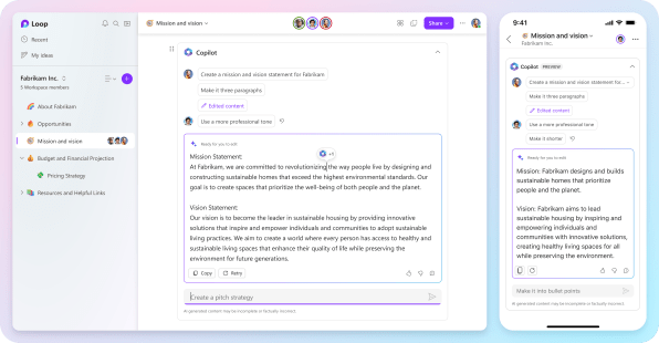
And yes, there’s also AI, or at least there will be. The Experiments section of Loop’s Settings menu shows an option to enable Copilot, Microsoft’s GPT-infused tool for generating and summarizing text, along with a Jumpstart toggle that can suggest ideas based on the title of a document. Both options are currently grayed out, though, and it’s unclear when they’ll be broadly available.
Where Loop works
I drafted most of this article in Loop, and it was a mostly enjoyable experience. The writing space looks clean and unpaginated, and I like its built-in grammatical suggestions, which have an array of toggles for attributes like tone, clarity, and inclusiveness.
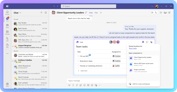
Loop also has a unique spin on the subpage concept: Instead of just linking to other pages, you can also embed them directly within a document. Microsoft calls these embeds Loop Components and wants them to feed into other parts of Office as well. That means users can edit a table or a notes page in Loop, then display just that component inside a Teams chat or Whiteboard space.
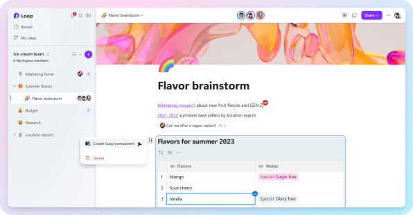
A few other pleasant touches: Loop’s sidebar menu can list website links alongside your documents, turning each Loop workspace into a kind of central hub for bookmarks and other Office files. There’s also a handy Recent view for documents and an Ideas section for personal notes, which you can access no matter which Workspace you’re in. Loop also just does a nice job auto-formatting links into visual bookmarks, with none of the extra steps that Notion requires.
What Loop lacks
Unfortunately, a lot of those clever concepts are undermined by shaky execution, to the point that I wouldn’t want to replace Notion with Loop in earnest.
Creating subpages, for instance, is just too cumbersome right now, requiring you to hit a “…” button in the sidebar and select New subpage. Creating an inline link to that page is even clunkier, as you must copy the link from the sidebar, highlight some text, and paste it as a link.
With Notion, it’s so much simpler: Just use a / command to create a new subpage within a document, or select any text and choose the option to turn it into a subpage. This quick flow between pages and subpages is part of what makes Notion so great for storing ideas, and Microsoft has completely missed this point.
Loop Components, while potentially useful, can also get confusing. If you’re used to Notion, you might expect newly-created Components to automatically appear in your document list, but that doesn’t happen with Loop. Instead, those components just float in the ether, waiting to be discovered through search or by manually looking through your documents.
Speaking of which, there’s no way to collapse Loop Components either. If you embed a lengthy document inside another note, you’ll always have to scroll past the entire thing to view the rest of your notes. Even the Ideas section feels clumsy, as it doesn’t support subpages like the rest of Loop. All you get is a long, disorganized list of notes instead.
On top of all that, Loop is just far behind Notion and other all-in-one document editors on features. A short list of omissions:
- There’s no trash bin or archives, so anything you delete is gone forever.
- You can’t embed files directly into a Loop document.
- Loop doesn’t yet integrate with any third-party apps or data sources.
- There’s no way to adjust text width, which to my eyes feels too wide.
- Formatting options are too minimalistic, with no block quotes, code blocks, multi-column views, or toggle boxes.
- Templates are limited to just a few from Microsoft. You can’t create your own or get them from the community, like you can with Notion.
Does it matter?
Microsoft says it’s listening to customer feedback and plans to add some missing features over time, such as third-party integrations and a trash bin. Right now, though, it feels more like an early tech demo than a proper Notion or Coda replacement.
Whether that’s actually a problem for Microsoft is another matter. As noted by John Gruber, Microsoft can be dangerously persistent when it feels a competitive threat. Its strategy with Loop may be similar to that of Microsoft Teams, whose chat tools aren’t as slick as Slack but has soared to 280 million active users nonetheless.
In the end, Microsoft may not need to create a better all-in-one document editor. It merely needs to be good enough to win over enterprises that are already inclined to use Microsoft’s products. It’ll probably get there in the long run, even if it still has a long way to go.
[ad_2]
Source link

