[ad_1]
Perhaps more than any other aisle of the supermarket, the egg section offers a range of options where cost—and assumed quality—is immediately legible from the package. Styrofoam cartons tend to offer conventional eggs. Plastic containers are for cage-free options. Pulp can indicate anything from store brand to farm stand.
Unlike, say, a pack of strawberries, whose color acts as an indicator of freshness, or a pint of yogurt whose ingredient list is a shorthand for quality, there’s no easy way to know the difference between one egg or another without cracking it open. Value needs to be indicated by the packaging.

As more egg brands have started to appear on shelves, they’ve gotten increasingly creative in their efforts to catch a casual shopper’s eye. Premium eggs brands, long dogged by confusing terminology (what’s the difference between cage-free and free-range?), have started to favor design rather than language as a means of indicating quality.

For a long time, the most visible player in this space was Texas-based, Whole Foods-endorsed Vital Farms, whose 2014 rebrand set the standard for distinguishing pasture-raised eggs from all the rest. (A quick primer on egg classifications, although the terms can be a bit squishy: cage-free eggs come from chickens who live indoors but can move freely. Free-range is similar—hens live inside, but have access to the outdoors. Pasture-raised eggs, the product of hens who roam outdoors, sit at the top of the ovicular hierarchy.)
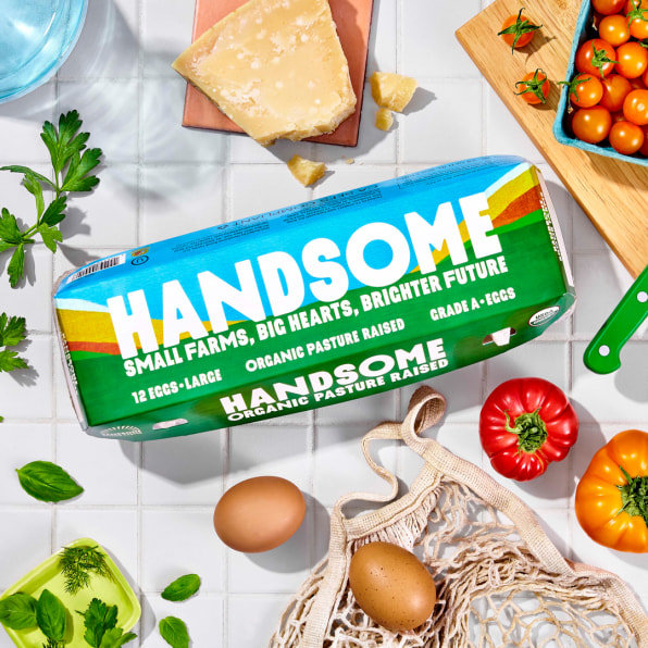
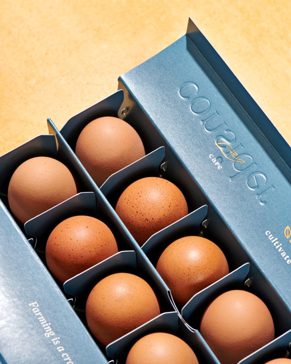
In the past few years, competitors have emerged that also aim to stand out in a crowded, but drab, shelf. Handsome Brook Farms uses bright, nature-inspired color and illustrations to allude to their high standards. (They worked with Red Scout on the rebrand that hit stores in the summer of 2020.) Meanwhile, the rich gilt-on-cerulean cartons from recently-launched (and Tik Tok viral) brand Consider Pastures were designed by Pearlfisher.

Despite the increasingly highbrow look of high-end eggs, Dan Brooks, former director of brand communications and design at Vital Farms, says his iconic redesign wasn’t about sophistication—it was about education. “At that point, pasture-raised was a vanishingly small percentage of all shell eggs sold in the United States,” says Brooks. “Our focus was really to establish a difference between what we did at Vital Farms, and what the other categories of eggs–free range, cage free, etc.–represented.” The “chalkboard aesthetic” that Brooks landed on had two functions: It conveyed the “farm to table nature of the product,” and engaged the consumers with the “essential talking points” (i.e., fresh air, sunshine, small family farms).
Vital Farms started as a single farm in Austin back in 2007. That same year, Handsome Brook Farms began as a farm stand in upstate New York. In the years since, both have grown into national brands. In July 2020, Vital Farms went public, raising over $200 million. According to research from wellness data-tech company Spins (cited in Vital Farms’ recent annual report), the pasture-raised egg market accounted for just under 4% of total U.S. egg retail sales in 2020, with annual growth of 35% between 2018 and 2020. There’s not just room for growth, there’s a precedent for it.

With its recent rebrand, Handsome Brook Farms seems primed to take on a higher profile as well. Its new design takes a more abstract approach to communicating the values of pasture-raised eggs. The company’s former carton, designed in 2017, “was getting lost in the mix” says Kristen Wharton, Handsome’s vice president of corporate responsibility, because its visuals—chickens, open fields, gingham—had become saturated within the category. “So the discussion,” Wharton says, “was really around, how do we evoke some of the same qualities about small farmers that we work with and care for the land, but do it in less of a direct way?”
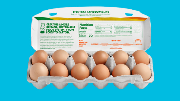
Priorities shifted in terms of messaging, too. “Instead of bombarding people with certifications,” the brand decided to keep the USDA Organic label on the front, but move American Humane Certified, an animal welfare rating, to the back. Inside the lid, there’s a graphic that compares the relative qualities of other egg feed (conventional, non-GMO, organic) and roam (cage-free, free-range, pasture-raised) options.

This shift from a more didactic design to a spare, evocative one is possible, in part, because Vital Farms’ packaging helped establish pasture-raised eggs as a uniquely valuable offering. “We were very fortunate that at that time we had a degree of exclusivity with the carton’s form factor—what’s known as a hybrid cotton,” says Brooks, “which naturally creates a far more aesthetically pleasing canvas on which to work.” Today, Handsome Farms uses the same materials. Consider Pastures, an offshoot of Pete and Gerry’s (which also owns Nellie’s Free Range), takes a different approach with a segmented, patent-pending paper carton that draws on egg carton design from the early 20th century, before pulp became the norm.
The opulent, limited-text look of a brand like Consider Pastures shows that today, packaging design is a more effective indicator of premium status than USDA terminology. At nearly $10 a dozen, pasture-raised eggs need to appeal to more than a consumer’s sense of animal welfare. They need to do something for their sense of self as well. “From their stunning amber yolks to their caring ethos,” reads the project description from Pearlfisher, “Consider Pastures makes the right choice much easier to make.” Unlike many premium products, pasture-raised eggs can play it both ways—they can frame themselves as a moral good, packaged like a treat.
[ad_2]
Source link

