[ad_1]
It’s a literal mile of showrooms, showing off the newest trends in chairs, tables, couches, and interior design.
As 400,000 people converged on Milan for this year’s Salone de Mobile trade show, 2,000 vendors showed off all manner of furniture, furnishing, and light fixtures in a leg-melting onslaught of product. And if that’s not enough, design events taking place across the city featured even more.
It’s overwhelming. But also, clarifying. I don’t know about you, but in a world in which we increasingly explore design through the bubbles of social media, it can be hard to know . . . What’s the real trend? What is everyone flocking to produce at the same time? What is the, “Can I still wear these jeans” of interior design?
To see it all side-by-side offers the chance to understand just that. Here are some of the big trends I spotted as we continue our way into 2023.
The new Formica? Redesigning our own waste
In 1913, Formica revolutionized design. It was a plastic resin, filled with flecks of color, that made its way through products and onto the surfaces of kitchens and bathrooms. A century later, we’ve found that aesthetic anew, through the lens of more sustainable and circular products.

Now, flecks of old ground-up materials are being mixed into new more sustainable plastics, molded into all manner of furniture. Samples of such materials were all over Milan. I saw dozens and dozens of sample swatches on display, eagerly being studied by designers. I even visited a concrete-focused studio, Cement Design, that offers a concrete paint flecked with old denim.
I found myself wondering if the future of sustainability meant that all of our new stuff would be flecked with bits of our old stuff, as we learned to live among our own refuse. But this very aesthetic is already taking on a meta life of its own. Take the Andes Sofa by Nichetto. It’s upholstered in a typical woven textile, but created with the look of a recycled-flecks pattern.

At Alcova, an experimental offshoot of the fair, I encountered Davidpompa selling whole rocks, like lava stone and a Mexican “café stone” that featured a similarly flecked appearance but required no plastic or synthetic materials. They postulate that you simply carve the stone into the object that you want.
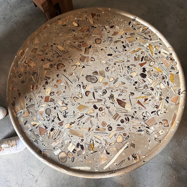
My favorite spin, however, was a new material called Forest Bank by designer Yuma Kano. This proprietary water-based resin is stuffed with twigs and leaves. You can even see the cross sections and rings of the wood. It was gorgeous in person, like maple candy filled with bits of the forest.
Midcentury modern may never die
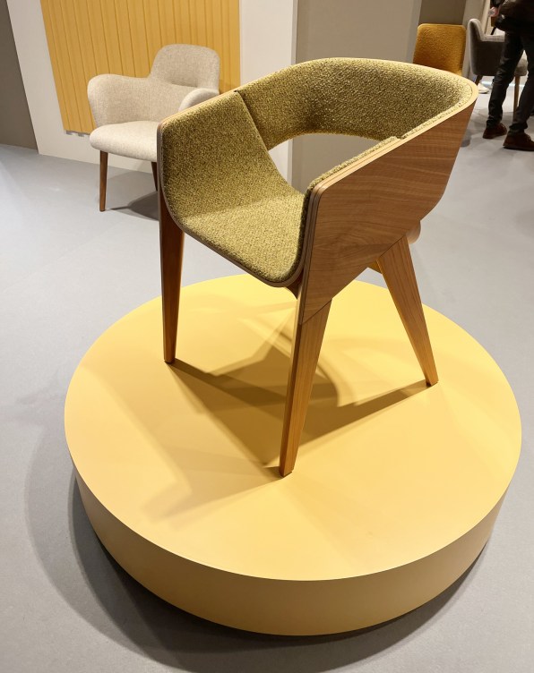
Call it midcentury modern. Stretch it to Danish modern. No reason to get too in the weeds here. All I know is that Mad Men has been off the air for nearly a decade, but the silhouettes of its chairs and tables live on.
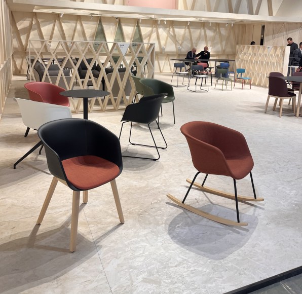
I suspect there are many reasons. The frames not only look light to the eye, but they are literally light, requiring minimal use of material. As for the shells of the chairs themselves, they’re flexible in form and material. They look fine in wood and upholstery or any manner of plastic. And as homes and offices have converged, it’s hard to say if that’s a chair meant for a kitchen table or a meeting room—so why not both?
Incidentally, it wasn’t just midcentury lines that remain intact. Marble, a popular midcentury material, was exceedingly present. Marble has been having its moment for some time now (from Target accents to fancy iPhone chargers), but walking the show floor, I am not kidding when I say that it felt as if I saw more marble-topped tables than not. Please don’t make me sick of marble, world! It’s too perfect a material to feel jaded with.
There are three kinds of lights
Rings. Blown glass. Balls.

These are the three lighting-fixture styles of the moment. They were absolutely everywhere on the show floor. The rings are LED halos. The blown glass is a hanging light wrapped in, you guessed it, handblown glass. And the balls were grapelike bunches of ball light fixtures.
Rings
Glass
Balls
You get it.
The swivel chair is the new La-Z-Boy
Remember the La-Z-Boy? Plush, comfortable, reclining . . . it was, on one hand, the epitome of self-acceptance in furniture, and on the other, a full concession of style.
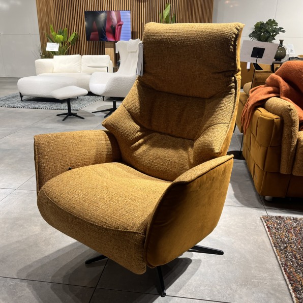
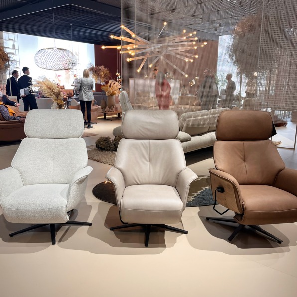
The traditional recliner is all but extinct, but comfortable furniture is decidedly in. Couches and armchairs seem to swell and bubble like marshmallows held over a fire. And in this climate, the La-Z-Boy is back, but in a European permutation: an upholstered, quasi-ergonomic swivel chair. I saw these pieces countless times, and while I personally wouldn’t call them stylish or a trend to chase, they’re clearly filling a niche. They’re a comfortable, adjustable, supportive seat that is decidedly not a task chair—unless your task is to binge Netflix.
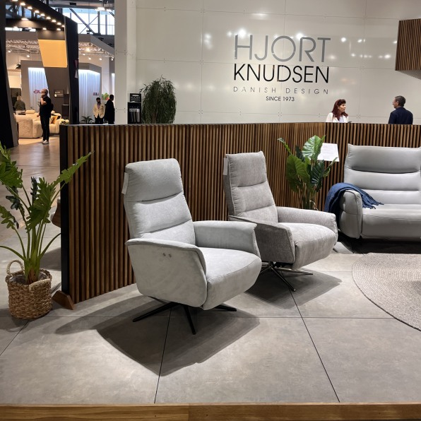
I also saw swiveling on low-slung and high-back chairs, outdoor seating, and even couches. Yes, couch seats were swiveling all over the Koinor booth, allowing you the opportunity to turn toward, or away from, the person sitting right next to you.
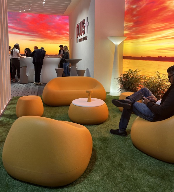
The sunset color palette is back, with a twist
Scientists now have actual evidence that the sunset has an awe-inducing impact, and this year the aesthetic was on full gradient display in Milan.
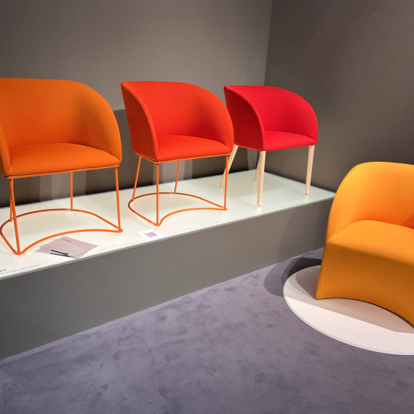
I saw the palette range in both booth decor and actual product, including chairs from KFF and Vigano.
Carolyn Ames Noble, a color expert and design collaborator at Turf Design, spotted it elsewhere, including the major lighting event, “Euroluce,” which featured Halo Horizon, a sunset projector first released in 2021. Another installation, Living the Horizon, featured an LED strip placed over a projection of sunset by lighting designer Ximena Muñoz.
You’ll notice that the sunset itself includes the implementation of goldenrod and powder blue (a blue that has been cropping up in fashion for some time, and that you can see on this new Louis Vuitton bag). And with its warm skew, the sunset works equally well with the rich cobalt blue that could be spotted on some furniture pieces and furnishings. Note: These two blues live side-by-side on the May cover of Harper’s Bazaar.
You might be asking yourself, wasn’t a similar ombré all the rage just a few years ago? Indeed it was! But as Forest Young, global head of brand at Rivian points out, the last wave of “sunset” was cooler, aimed more around the language of technology. This new wave seems more attuned to our recent return to nature (notice how plants are in, and green has been the new black for the past few years). Young also sees significant overlap, of late, between sunset and the haute rise of oil-slick iridescence. Indeed, I came across several furnishings that featured a visual color shift in the fabric itself, almost like the textile version of a Chameleon Paint sports car.
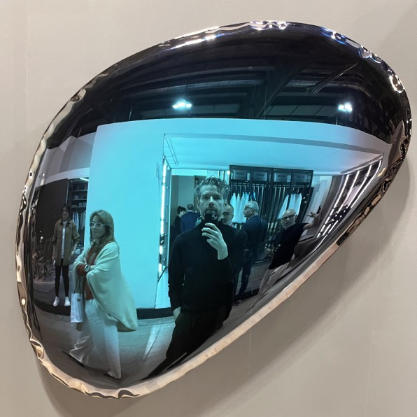
We keep waiting for the sun to set on this particular design trend, but one thing seems for sure: Sunsets will never go out of style.
[ad_2]
Source link


