[ad_1]
For decades, marketers of consumer goods designed highly adorned packages, deploying bold colors, snazzy text, cartoons, and illustrations to seize the attention of shoppers. Conventional wisdom held that with thousands of products competing against one another in the aisles of big-box stores and supermarkets, companies needed to do everything in their power to make their products stand out.
But recently, there’s been a move toward simplicity. The stripped-down packaging you’ll often see is reminiscent of the minimalist art that flourished in the 1960s. A reaction against overly complex, representative works, the art that emerged in this period was characterized by spareness and abstraction. Any elements deemed unnecessary were removed.

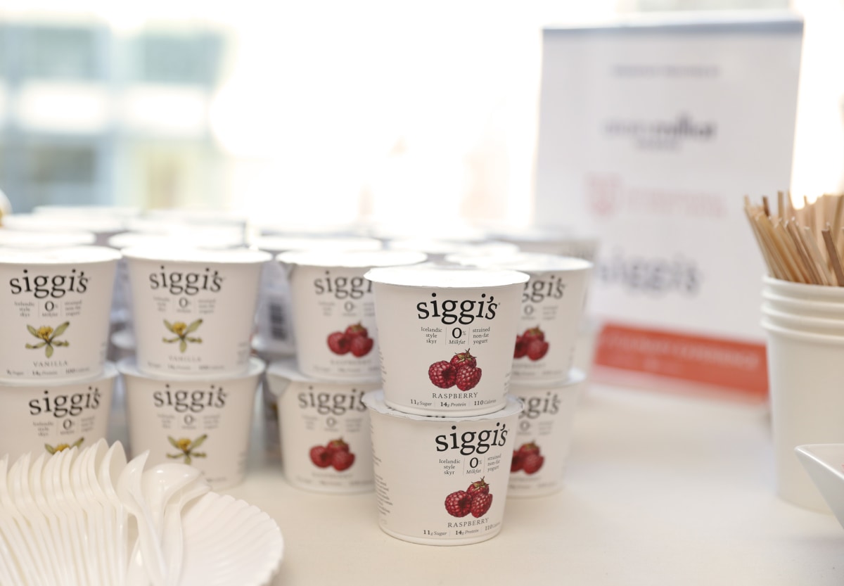
Siggi’s Dairy keeps its yogurt packaging simple: white with black text and a dab of color to indicate the flavor. [Photo: Neilson Barnard/Getty Images for The New York Culinary Experience]
When less is more
First, we wanted to see if shoppers were willing to pay more for products in these packages. So we analyzed over 1,000 consumer goods, such as shampoo, deodorant, crackers, and cereal, from the largest supermarket chain in the U.S.
We had two research assistants code for the extent to which the packaging design was simple or complex. We then averaged their ratings to create a measure of packaging design simplicity. From this data, we found that products in simple packaging generally had higher retail prices than similar products that didn’t. The higher retail prices indicate that shoppers are willing to pay more for products in this packaging.
Next, across a series of experiments, we recruited students from a public university. We asked them to look at different packaged products, tell us how much they were willing to pay for those products, how many ingredients they thought the products might have, and how pure they perceived the products to be.
We found that the preference for simple packaging was due to the fact that pared-down designs sent a subtle yet powerful signal: purity. This happened because the simplicity of the product package made participants more likely to assume that the product contained fewer ingredients, along with fewer preservatives, added colors, or artificial flavors.
People will pay a premium for products that don’t have additives or chemicals, whether it’s food, cleaning supplies, or soaps. And this may explain why the study’s participants were willing to fork over more cash for products that appear in simple packages—regardless of whether they actually contain fewer ingredients.
Several brands illustrate the ability of simple packaging to attract shoppers.
Kashi’s cereal boxes employ a muted color scheme and avoid overloading the package with claims or extensive product descriptions. Siggi’s yogurt containers embrace white spaces, muted colors, and straightforward imagery, highlighting only the crucial product details.

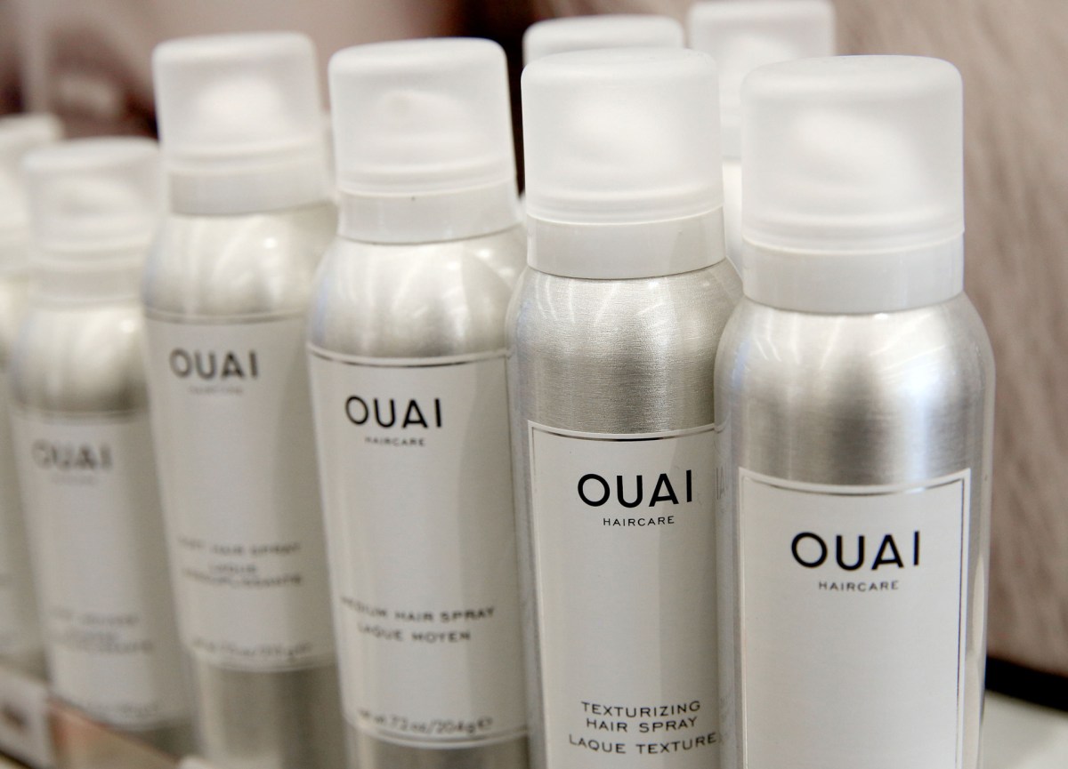
OUAI hair spray bottles feature a minimalist design. [Photo: Rachel Murray/Getty Images for Sephora]
When less is less
However, simple packaging design is not always effective. We found that products from generic brands fail to reap the same premiums as minimalist packaging. A product from a generic brand is one that does not have a brand name and is typically sold at a lower price than name brand equivalents.
In the case of these products, the simplicity of the packaging seems to align with customers’ beliefs that generic brands invest less in the quality of their products. So it’s possible that the simplicity of generic product packaging signals a lack of investment in the product rather than fewer chemicals or food additives.
The desires of shoppers can also influence the preference for simple packaging. When people seek healthier options, we found that they’ll pay more for products with simple packaging. However, when consumers want to indulge in junk food, they’ll be more inclined to purchase products with complex packaging, which signals many ingredients and lower purity—qualities associated with more flavor.
So when it comes to minimalist aesthetics, less can often be more. But in some cases, less is simply less.
Lan Anh Nu Ton is an assistant professor of marketing at Texas Christian University.
[ad_2]
Source link

Comments are closed.