[ad_1]
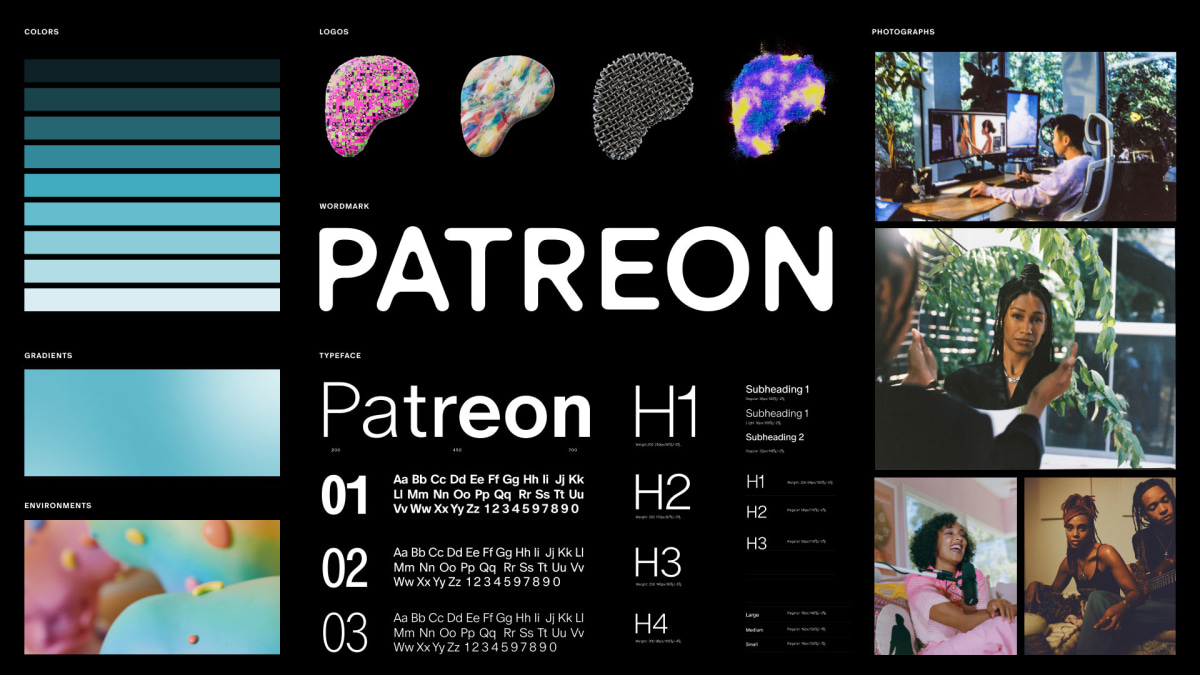
When Patreon announced its rebrand on October 4, the news set one corner of the internet on fire. It also sparked a debate on the Co.Design slack channel, as my colleagues and I scoured our brains for historical precedent. The shape had drawn parallels to a liver, an amorphous blob, and even the Eraserhead baby. But the creative direction, centered around a shape-shifting logo, seemed awfully familiar, as well.
Eventually, the internet delivered where our brains failed: Aol; The Brazilian telecom company Oi; Zocdoc; The Tate Modern. The more we looked, the more shape-shifting logos we found. But here’s the best part: every single one of these brand identities was designed by the same studio—Wolff Olins.
The global brand consultancy doesn’t have the monopoly on shape-shifting logos. Back in 2013, the San Francisco design studio Ammunition designed a fluid logo that can take an infinite number of shapes. And more recently, designer and coding whiz Talia Cotton used an algorithm to create a logo that constantly redraws itself.
But where Wolff Olins stands out is in its consistent, borderline obsessive use of morphing logos. Over the past 10 years, Wolff Olins has led at least eight brand identities featuring some kind of shape-shifting typography, image, or texture. That’s almost one shape-shifting logo every year.
We decided to find out why.
The shape-shifting logo comes in many forms. There’s the dynamic logo, which features some kind of animation; the adaptable logo, which is flexible enough it can be reimagined by various stakeholders; and the responsive logo, which can be scaled to various screens and sizes but also change based on specific inputs.
Wolff Olins has done them all.
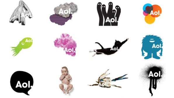
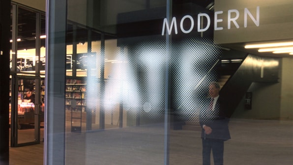
One of the earliest examples of a morphing logo in the brand’s portfolio is the Aol rebrand in 2009. Not long after, the studio launched a new brand identity for the Tate museums that was later overhauled by design agency studio North. Then came the much, much, much criticized logo for the London 2012 Olympics, which looked less like an emblem of the games and more like a graffiti mark. Then it was Zocdoc in 2016; Oi in 2016 (it featured a shape-shifting logo that changes color and shape based on the sound of a customer’s voice); The New Museum in 2017; and the social impact organization Understood in 2020 (the morphing “U” was meant to represent “you and your world.”)
Now, assuming neither I nor Wolff Olins’ executive creative director Jan Eumann have missed examples along the way, there is Patreon in 2023. Eumann joined the company as an intern in 2007 and has since climbed the rungs of the executive ladder until he became executive creative director in 2021.
He says that throughout the years, the studio has had different reasons for bringing morphing logos to each of these brand identities. With Aol, the goal was to shift the narrative from a generally disliked business to one that is seen as the gateway to the internet.
“The big shift that we had to make from a design standpoint was to figure out how you tell a story that Aol is nothing if there isn’t content,” he says. The team understood that no single image could convey the depth and breadth of the Aol brand, so instead, they opted for a still word mark against an ever-changing backdrop of images.
In later examples, Wolff Olins used “dynamic identities” as Eumann calls them, to reflect, well, the dynamic nature of a brand, its audience, or both. With Zocdoc, they tweaked the letter “Z” to match a variety of facial expressions and reflect the various emotional states a patient might feel when looking for a doctor. With the Tate museums, they created a family of pixelated logos that move in and out of focus to unite the various Tate branches and reflect their differences ahead of the Tate Modern launch in 2020. With The New Museum, they essentially made a typographic sandwich of the words “New” and “Museum” and let the museum pick what fillings they wanted to put inside, creating a constantly renewable logo. As for London 2012, controversial as it was, they designed it so that anyone and everyone can take ownership of the logo and make it their own. “Adidas, one of their core sponsors, took the logo, made it black and white and introduced the stripes,” says Eumann. “It was a very beautiful activation.”
-
![]()
AOL [Image: courtesy Wolff Olins] -
Zocdoc [Image: courtesy Wolff Olins] -
![]()
Tate museums [Image: courtesy Wolff Olins] -
![]()
New Museum [Image: courtesy Wolff Olins] -
London 2012 Olympics [Image: courtesy Wolff Olins]
That idea of cocreation has been taken up a notch now, with Patreon. From the very beginning of the rebrand, the Patreon team knew they wanted something that is “moving,” and “living,” and “breathing” as Patreon’s chief product officer Julian Gutman told me. Wolff Ollins had been mastering that strategy for a decade, so naturally, they got the gig. (Patreon also partnered with Australian designer David McCleod, creative digital production studio Active Theory, and Swiss type design agency Dinamo.)
Notably, the team pushed the idea of cocreation one step further. “So much of what Patreon is is what creators make of it, they’re the stars behind Patreon,” Gutman says. “We give them the tools and the software but ultimately they’re the ones who make the magic, and how do we build a brand that represents that?”
The answer: let them make magic by making their own logos within a predetermined framework. This means you can’t create a brand-new logo of, say, a banana that peels itself then unpeels itself. But when the feature rolls out sometime next year, you will be able to create a version of that liver-shaped blob and dress it up in a color or texture of your choosing, or even play with the way it moves by simply typing a prompt like you would in an AI image generator. If you have a podcasting business, for example, you might design a logo that pulses a bit like a sound wave.

[Image: courtesy Wolff Olins]
But is that too much freedom? The new identity has only been live for two weeks and it has already been widely criticized for its lack of distinction. And in a world where shape-shifting logos are becoming the norm, is distinction even possible?
Eumann notes that a brand like Patreon doesn’t need the level of distinction that another company might require to stand out because more often than not, people discover the brand through the creators they follow, not on the app store (unless you’re the creator, that is.) That said, he admits the same approach wouldn’t work for everyone: “If you were to design a brand that is about shelf presence and brand equity, that needs to be recognizable,” he says.
So, is Wolff Olins done with shape-shifting logos? Not necessarily, though Eumann is intrigued by the role AI can play in generating a sense of newness. “Could a logo be an NFT?” he asks. “I think our approach, like on every project, should be to figure out what’s the most befitting technology for the brand, but then also how does the technology allow us make sense of what the brand is trying to talk about in the world.”
[ad_2]
Source link


Comments are closed.