[ad_1]
Midcentury modern architecture, it seems, will never go out of style. After suffering a blip of critical revulsion in the 1980s and early ’90s, this movement based in artful simplicity, functionality, and modernity roared back and hasn’t faded since. But what does modernism—midcentury or otherwise—offer that makes us keep returning to it? What did its practitioners know?
A new book, Modernist Icons: Midcentury Houses and Interiors, proposes a few answers. This is not a book that scholars of the period will look to for great new revelations. It doesn’t levy many worthwhile indictments of the movement—malignant tendencies like obliterating historical contexts, favoring (like most architecture) the white and well-connected, and in its worst cases losing touch with the human experience in favor of cold, top-down grandiosity. But it effectively captures the spirit and attributes of the movement—a spirit that arguably has as much resonance today as it did during the Modernist movement’s beginnings in the early twentieth century.

[Photo: courtesy Gestalten]
Perhaps the least surprising of modernism’s still-relevant traits is its elegant simplicity and practical functionality (all the more important today, when a constant cacophony of information and imagery bombards our senses). While many preceding styles had foregrounded historical styles and intricate applied ornament, modernism’s merger of art and industry, focus on structural honesty, and almost complete rejection of the past, made it something altogether new.
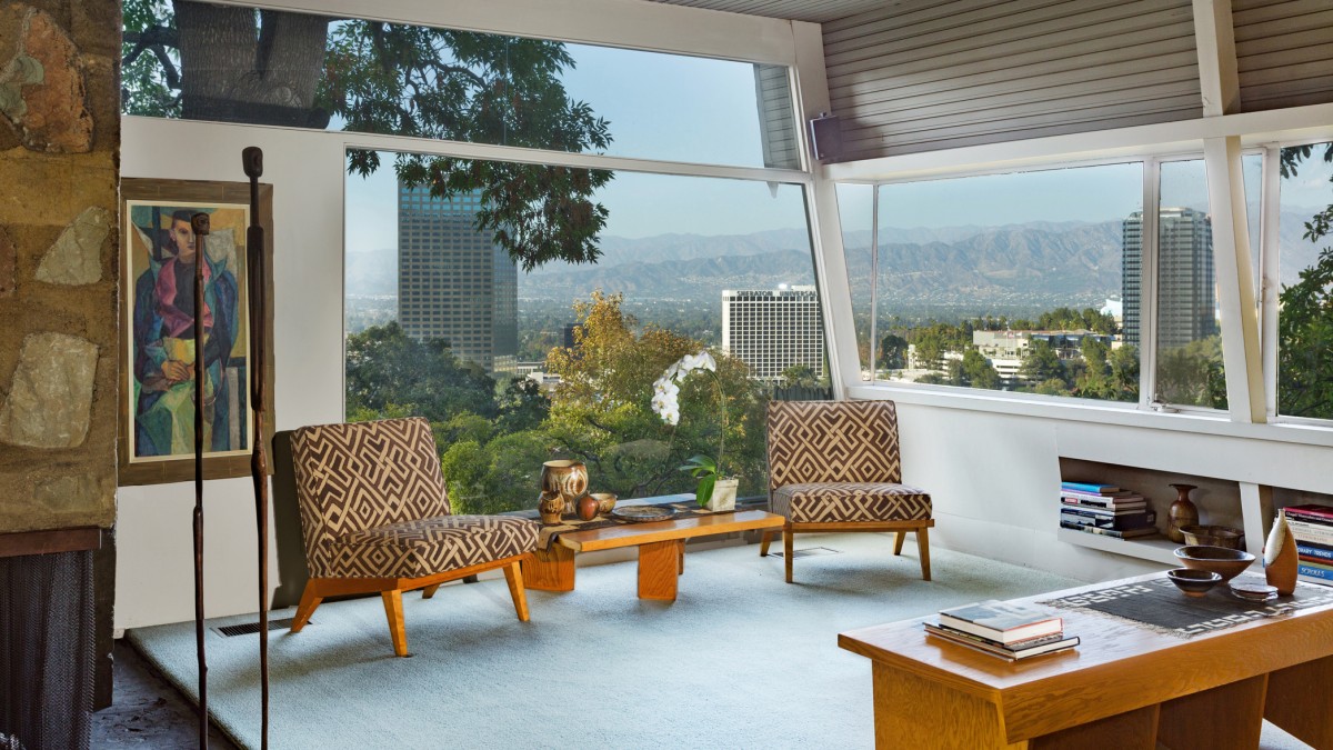
Rudolph Schindler, Kallis-Sharlin Residence, Los Angeles, CA, USA. [Photo: Cameron Carothers/courtesy Gestalten]
Paging through the book is a mostly calming experience, filled with simple forms and lines, straightforward use of materials like steel, concrete, plate glass, plastic, and aluminum. Just look at two of the most famous modernist houses of all time: Philip Johnson’s Glass House (1949) and Mies van der Rohe’s Farnsworth House (1951). These immaculate, rectangular structures consist almost exclusively of glass and steel, and contain minimal, uncluttered furniture. These are not fussy buildings; they are pared down vessels intended to accentuate their industrial materials and accentuate their bucolic surroundings, creating, as the book says, “a fluidity between interior and exterior spaces.”
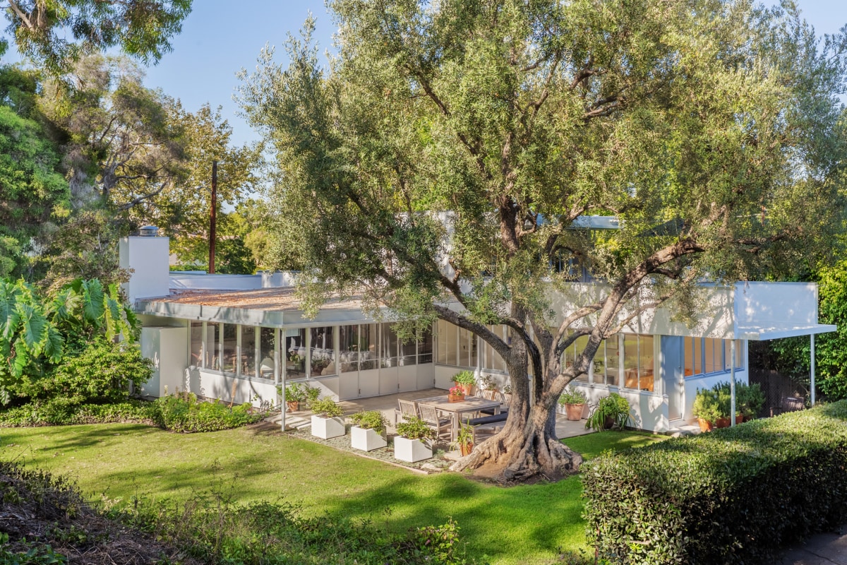
Richard Neutra, Brice Residence, Los Angeles, CA, USA. [Photo: courtesy Gestalten]
A connection to nature
Which brings us to another seminal attribute of midcentury modern: its connection to nature. While modernist homes are often stereotyped as cold and sterile, their heightening of the natural world was often a core goal, realized effectively through lightweight and often transparent materials.
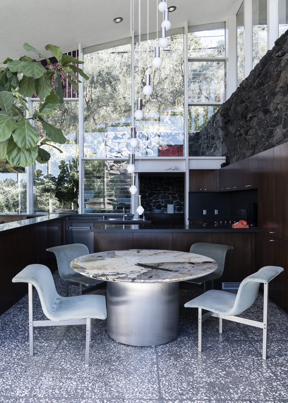
John Lautner, Garcia House, Los Angeles, CA, USA. [Photo: Giorgio Possenti/courtesy Gestalten]
One of the best, and most iconic, examples in the book is pioneering architect and designer Eileen Gray’s Villa E-1027 (1929), perched just above above the rocky shoreline of Roquebrune-Cap-Martin, on the French Riviera. The minimalist home’s large windows, skylights and balconies make it a perfect place to commune with one of the most beautiful locales on earth, with all of its sun, breezes, and epic views. The bold array of colors, including shades of blue, green, and yellow; all pick up on the colors of the landscape.
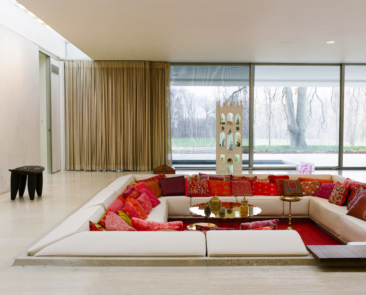
Eero Saarinen, Miller House, Columbus, IN, USA. [Photo: Leslie Williamson/courtesy Gestalten]
The home’s connection to the landscape is present in virtually every residence in the book, no matter where it sits, be it Rafael Soriano’s Grossman House in sunny Los Angeles or Peter Womersley’s High Sunderland in often rainy Selkirk, U.K. All take advantage of the tools of modernity to foreground the natural world around it.
The replicability factor
If we’re talking about midcentury modernism’s impact today, perhaps no aspect of the movement is as relevant as its efforts to create simpler, replicable designs that could bring architecture to the masses. With our dire housing shortages and affordability crisis, we could learn a lot from several of the projects in this book. There are dozens of examples, but I have to mention those by French architect Jean Prouvé. Today known largely for his furniture design, Prouvé was an engineer and designer who was as interested in structure and replicability as he was in beauty. After the devastating destruction of World War II, Prouvé set out to mass produce prefabricated “demountable houses” that could be easily made in factories, including his own production facility outside Nancy, France.
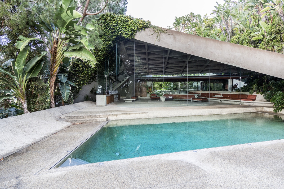
John Lautner, Sheats-Goldstein Residence, Los Angeles, CA, USA. [Photo: Tom Ferguson/courtesy Gestalten]
While that dream never came to fruition, homes like Villa Jaoul (1956), Villa Seynave (1962), and the Gauthier House (1962) all contain equally beautiful and practical elements of that thinking, including prefabricated steel, wood, and aluminum panels, built-in furniture made from industrial materials, efficient layouts, and exposed structure.
This impulse to make housing accessible, often in large quantities, is shown throughout this book, from the Eichler, Alside, and Case Study homes of the United States to Le Corbusier’s experiments with the modular Unité d’Habitation. Their thrift seems a bit ironic today, given that modernist homes now are often associated with elegant, high-priced luxury. Never underestimate capitalism’s ability to co-opt idealism.
The strands of midcentury modernism
The book helps refute the idea that modernism was limited to a singular palette; a simple cut and paste around the world. While many examples of the so-called International Style did proliferate this way, so many strands of Modernism grew locally, adapting local cultures and responding to local conditions. This being a worldwide survey, some of these locales get short shrift, like India, Asia, and Australasia. But a true strength of the book is its fantastic offering of homes in Brazil, where “Tropical Modernism” merged an outsized connection to nature with vivacious local forms, colors, and craft.

Paulo Mendes Da Rocha, Butantã House. São Paulo, Brazil. [Photo: Leonardo Finotti/courtesy Gestalten]
The sinuous exuberance, bright colors, and lush landscapes of Oscar Niemeyer’s Das Conoas House (1951) outside Rio, or Lina Bo Bardi’s Glass House (1951), outside Sao Paulo are partnered with lesser known, but perhaps even more exciting projects like Joao Batista Vilanova Artigas’s Rubens de Mendoça House (1958, Sao Paulo), integrating colorful white and blue exterior triangular facade murals, bright red, canted internal columns, and lots of warm hardwood detailing to create a masterpiece of fresh dynamism. Adding to this list are several homes by Brazilian master Paulo Mendes da Rocha, who used thick, textured, raw concrete to carve out dramatic openings and cantilevers and approximate aged natural surfaces in ways that are simply astounding.

Rudolph Schindler, Kallis-Sharlin Residence, Los Angeles, CA, USA. [Photo: Cameron Carothers/courtesy Gestalten]
Modernist Icons, like modernism itself, is at its heart optimistic and not intensely self-critical. It fails to clearly distinguish some of the nuanced permutations within modernism during the midcentury, like concrete-focused Brutalism, naturally-shaped Organic architecture, historically inspired New Formalism, and Space Aged Googie architecture. And while its title suggests otherwise, many of the key icons of the movement—like Rudolph Schindler and Richard Neutra’s own houses, Le Corbusier’s Villa Savoye, and Bauhaus founder Walter Gropius’s own home—are missing.
Still, it’s a useful introduction to the global reach and often positive impact of midcentury modernism. As we face ever mounting challenges, we can’t repeat modernism’s cardinal sin of ignoring the past. We should employ its strengths as tools to help solve the problems of the future.
[ad_2]
Source link

Comments are closed.